Hasselblad Releases the Second Episode About their Design Decisions
Hasselblad is back with another video in its ongoing behind-the-scenes series, ‘Hasselblad’s Home.’ In the inaugural video, titled ‘The Design Philosophy Behind Creating the X System,’ Hasselblad shared an inside look at what went into developing the company’s mirrorless medium format camera. Now, in episode two, Hasselblad shares what’s gone into developing the ergonomics, materials and user interface of the Hasselblad X System.
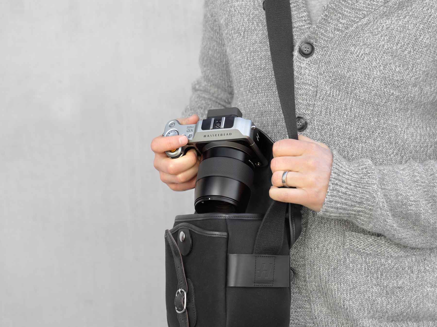
This episode is focused on design decisions behind the ergonomics, materials, and user interface of its mirrorless cameras. Hasselblad’s initial X1D and following cameras have a similar design that features a particularly large and deep grip, which according to the company was one of the most important changes it wanted to make going into the design of the camera over previous devices.
“The grip was one of the things that went through the most changes for the X System. I think we went through at least 10 to 15 3D-printed versions,” the company says. “It was extremely important that it was comfortable and gave a firm and secure feeling. We also designed it with the thought that it should fit various hand sizes, which made the process more complex.”
One of the crowning achievements of the Hasselblad X-System is its menu, which the company says was made to be both simple and usable. The user experience was designed to mimic what can be found on modern smartphones. The video also discusses the material choice for the camera, which is machined aluminum. To Hasselblad, alumunum was chosen because it is both robust and lightweight and was able to keep the camera’s temperature cool.
More info on Hasselblad’s Channel.


